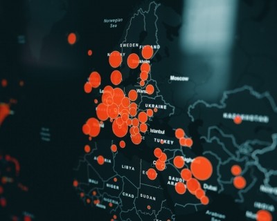
New York, December 25 (IANS): Back in January 2020, Lauren Gardner, co-director of the Johns Hopkins Center for Systems Science and Engineering, was tracking measles data when a couple of her PhD students began talking about a new coronavirus in China.
Many of these students were Chinese and they were already tracking it closely. In a few hours over one evening, one of Gardner's students built an original Covid-19 dashboard from scratch.
By the end of February, the Johns Hopkins global dashboard was getting a billion hits a day. By the summer, it was 4.5 billion hits a day and more than a billion "feature requests" to access the underlying data.
2020 has been a breakout year for visualizations at the intersection of data science, epidemiology and predictive models, focusing the energies of large groups of data scientists coming together to
build tools for population scale access.
In the US, the first case of COVID-19 was diagnosed on January 20, 2020. By January 22, Johns Hopkins shared its Covid-19 dashboard publicly, loaded with the location and number
of confirmed cases, deaths, and recoveries for all affected countries.
All data collected and displayed was made public, initially through Google Sheets and later through a GitHub repository, along with the feature layers of the dashboard.
Gardner was named one of the 100 most influential people in the world by TIME for her work developing a free and open website that has become a global go-to resource.
In parallel, predictive models took off, providing more than just 101 tracking.
These plunged into infection projections, hospital bed availability, lockdown, scenario planning, mandates for easing restrictions and so on. Many of these models have open sourced access to the documentation and the code.
When the White House coronavirus task force nudged us in the direction of one such from the Institute of Health Metrics and Evaluation (IHME) at the University of Washington, we never stopped checking in, even after the White House briefings ended abruptly.
Task force member Deborah Birx pointed to the scary infection curves to tell Americans to mask up, Trump told Americans masks are optional and in the spaces in between, all hell broke loose.
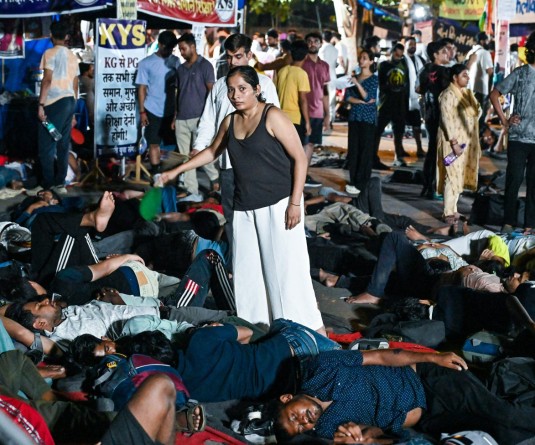
By December 10, the virus was killing one American every 30 seconds, and 150 cases were being reported in the same minute. The country is home to the world's highest coronavirus caseload and deaths. More than 18 million infected since January and more than 328,000 dead and there's no sign of easing off.
The math was deadly from the time this exploded in China. We don't need complicated math to comprehend its rampage and yet infection curves based on imagined futures are splashed on the world's screens, a roller coaster trajectory of utter chaos.
"Do models play a critical role?
"Absolutely, models provide a visibility into possible impacts and allow the common man an ability to view this and do the required needful planning," says an open source and Community Data Scientist. "This is indeed a new high for models seeing visibility," he told IANS.
Data scientists everywhere agree that data accuracy, its collection and the maintenance of predictive models have been incredibly complex and problematic, although evolving.
Now that vaccines are arriving, a lot of developers are taking a hard look at the sunset clause for the models they created to serve as digital public goods during a health care emergency.
It's not just about the time-cost of maintaining models that's on their mind, it's also the traffic.
Not all models enjoy the wild popularity that the Johns Hopkins tracker does and when public use dwindles, engineers say it's hard to just keep going. Initially, the sense of "control" they got over "things we can't control" fuelled their energy; but eventually, real world application won out.
Also, models have had a hard time in the public square.
Briefly, during Spring, the reliability of one model versus another was front page news and very quickly, the mood swung to the other extreme.
In many countries, editors at leading news publications were often wary of publishing model projections because they feared government pushback. People stopped sharing predictive model links with their friends and relatives when they got messages saying things like "it looks bad, I don't want to see this stuff."
The combination of lack of trust in the source data and pandemic fatigue wasn't just at the household level. Even governments jabbed hard. In fact, in the US, those who did not trust the IHME model bet on far gloomier infection curves from the University of Pennsylvania model.
Politics too got in the way, big time. The Centers For Disease Control and Prevention, America's premier public health agency, was effectively sidelined by March.
With zero consensus on viable streams of data, state governors went all in local universities and developers for do-it-yourself models. New York Governor, Andrew Cuomo, who won an Emmy for his daily press briefings during the state's worst phase of the outbreak, described as "maddening" the range of estimates from predictive models.
In America, the cultural flashpoints turned out to be even more so, which made predictive models that much more slippery.
Despite all the skepticism around how models can be used effectively and governments' reluctance to endorse these algorithmically mediated projections, data science-led use cases from the 2020 pandemic have already revved up action around the next big thing in digital public goods: Community models.